|
|
Advert Production |
|
|
|
Advert Production: |
|
Locations
|
Initially I planned on doing 2 photo shoots in 2 different places, indoors and outdoors in nature and greenery. I wanted to do a photo shoot in the Gym where the elements of strength were going to be incorporated where I may have had my models exercising or actually using machines where the advert would look as realistic as possible. The second location I would have chosen if the Corona Virus hadn't restricted me was going to be in or around a beach with some greenery or a park near by. This would have taken place very early around 4-5:30 am where the sunrise would be included in the images to include the element of nature and beauty and also there will be no people or massive crowds which will make it much easier to capture a clear and focused shot.
For The gym photo shoot I would have used the British school's gym since I have access to it and could get permission to do photo shoots after or before school hours. For the beach/park photo shoot I would have went to the Mouj Beach where one of my friends would allow me to access the beach as they are residents and so we would have access to a private beach and the space would be clear and quiet. However due to the Global Pandemic that we are going through I will not have access to any of these places as they are closed and we are in quarantine at the moment. Instead I will use the backyard and garden of my villa since there is a lot of space with different ideas for different photos to make it look different but still have the same vibe or theme. I will also use the roof of my house as it is a big space and is empty. |
|

|

|

|
Models Makeup
|
Initially I was going to use a group of friends (different cultures and races) to include a mixture of audiences and broaden my market however due to the pandemic, I had to change my plans and therefore I will be using myself and my female Russian neighbor to try to deal with the pandemic and still manage to have a wider audience. Both me and my neighbor have experience in modelling as I have had to model for multiple friend's projects and she also studies media and photography and has modeled before.
|
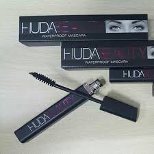
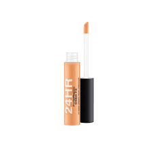
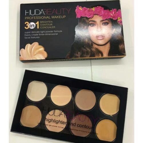
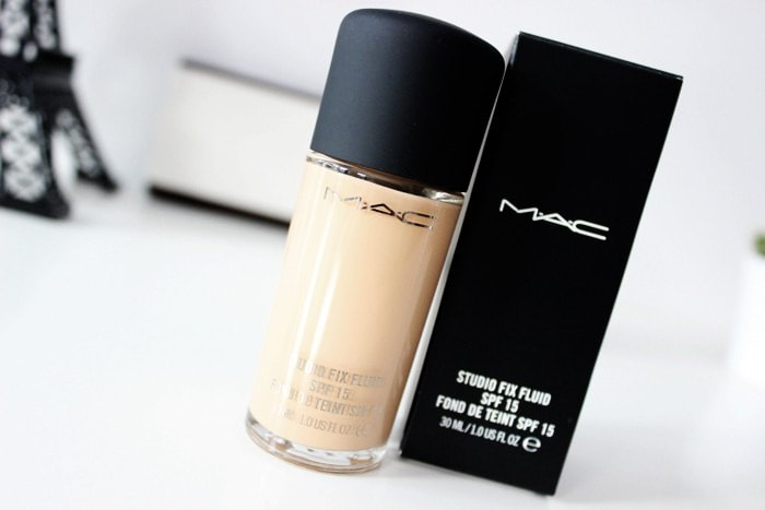
Sports adverts and models tend to have minimalist makeup as they go for more natural looks as they want their adverts to look as realistic as possible. So I decided to use very basic beauty products where I would use very basic and disguised products. I will use foundation, mascara and light contour. This will allow me to relate to most of my customers as they will most likely focus on exercising and comfortable stylish clothing rather than makeup. I will be applying the makeup as I want to get the natural soft look with some highlights to capture that 'Golden Hour' look.
The following are the brands and make-up items I will be applying to my models:
|

|

|


Clothes
|
With the clothes choices I wanted to choose something sporty and has chilled vibes where the advert would not all be focused on the clothes and balance the order of information. I also wanted something to compliment the model's body and so I chose the following two outfits. I thought they would work really well and would be easy to photo shop if needed to, I would have the options to play around with the colours of the advert and the palette I might use.
|

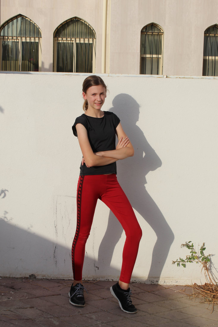
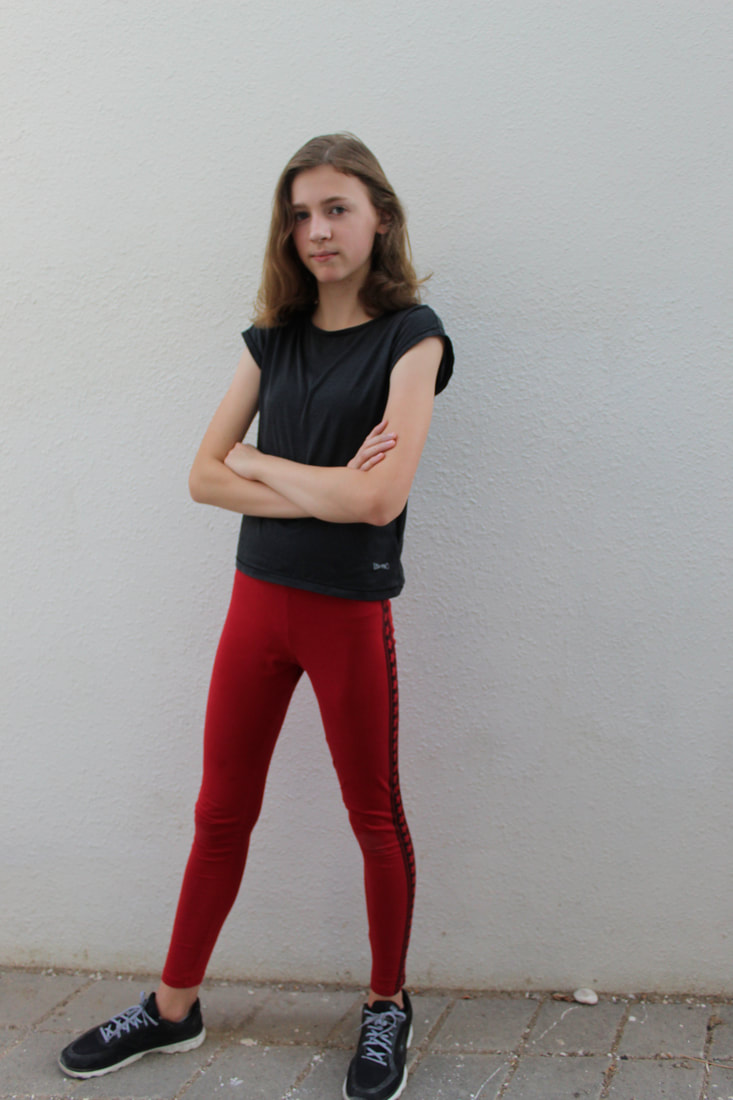
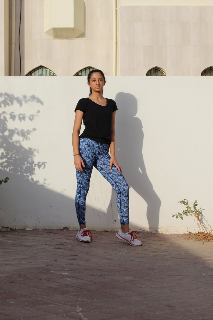
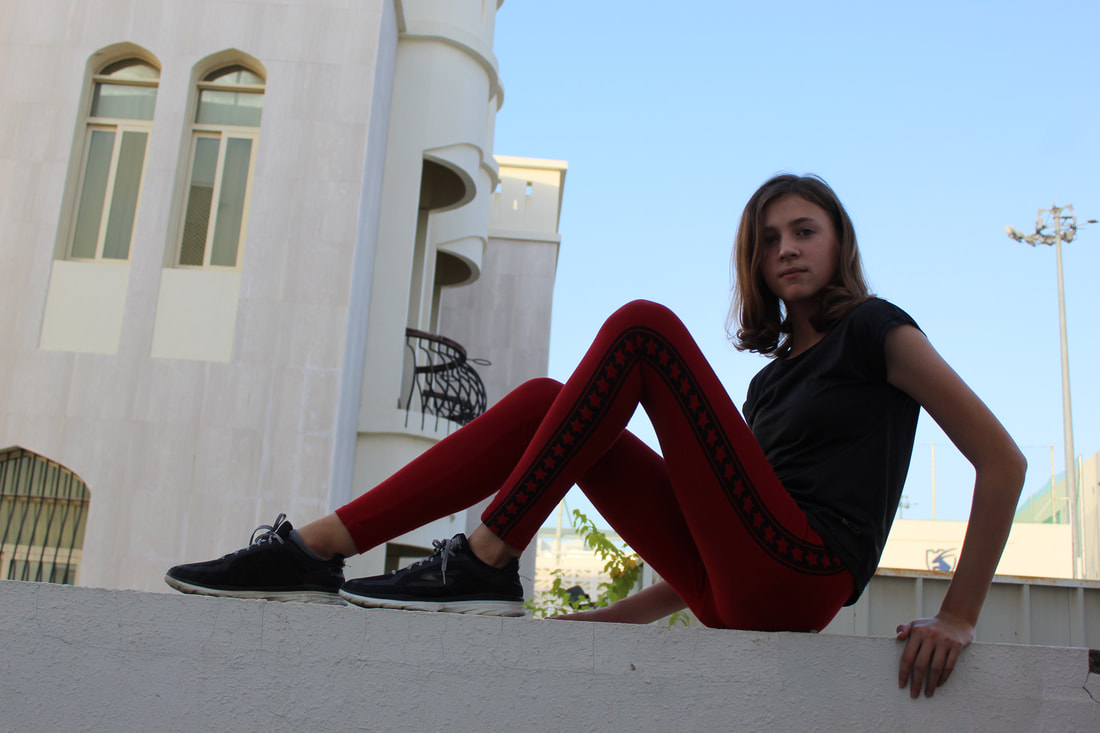
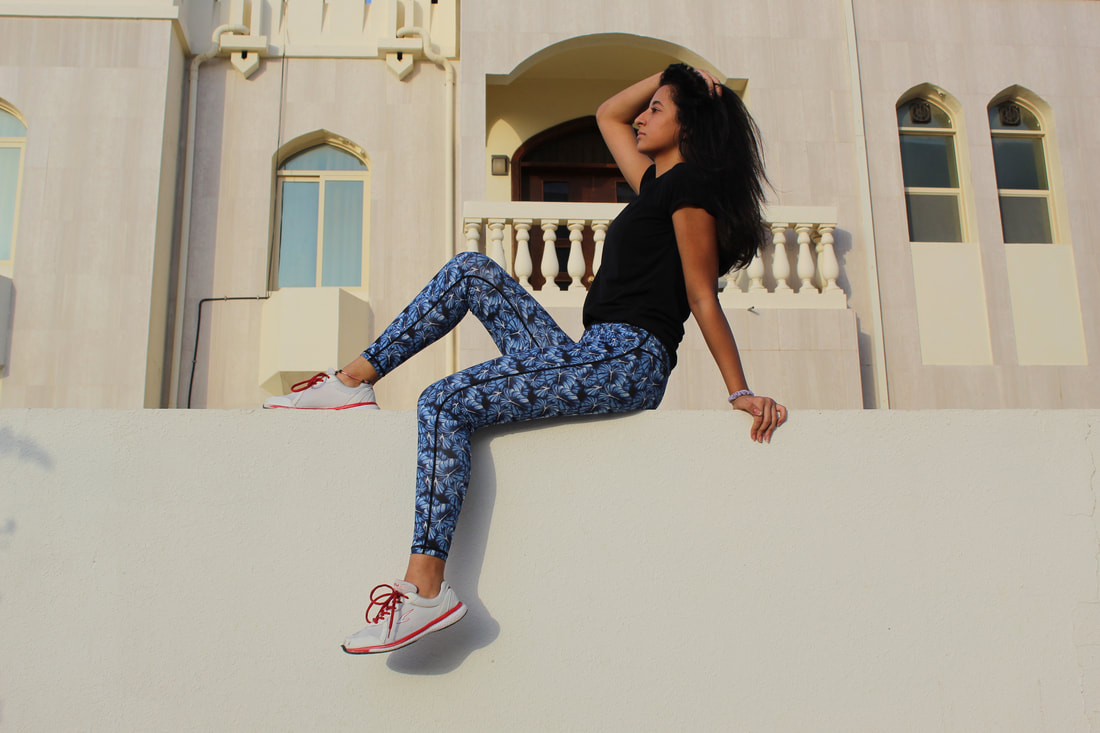
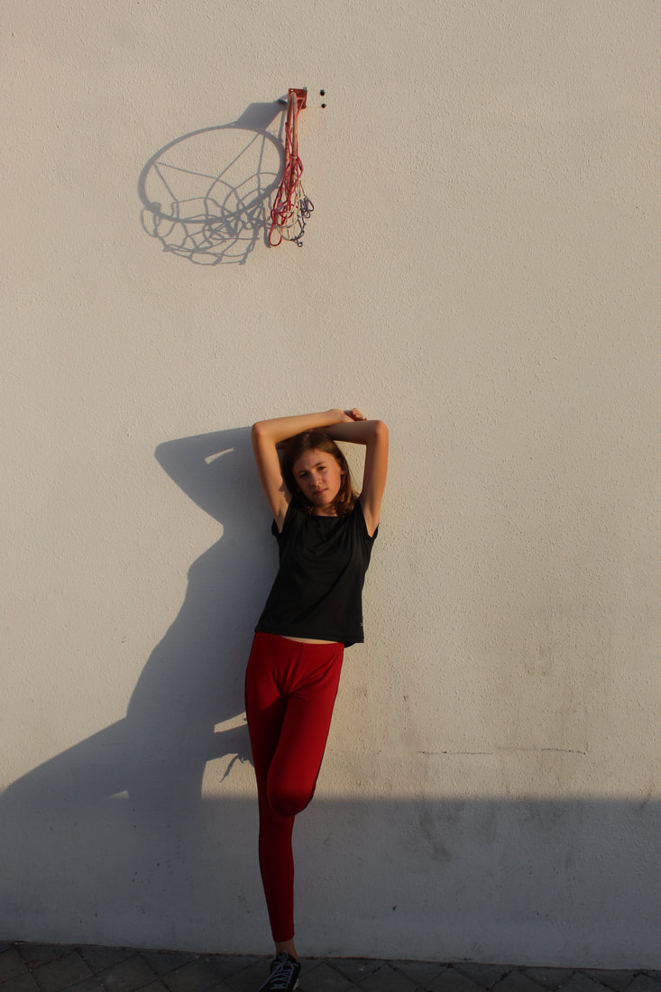
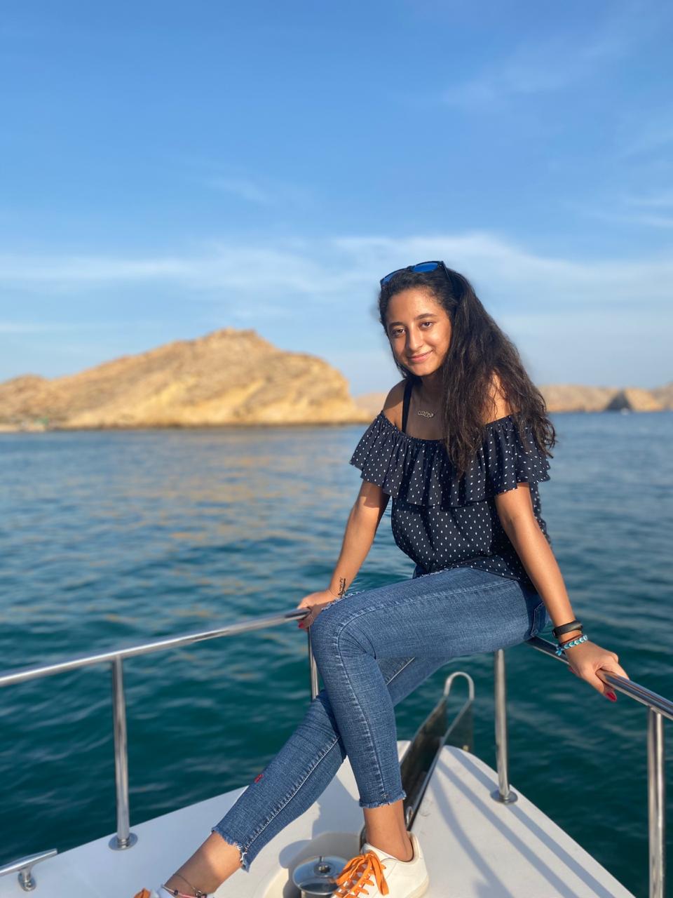
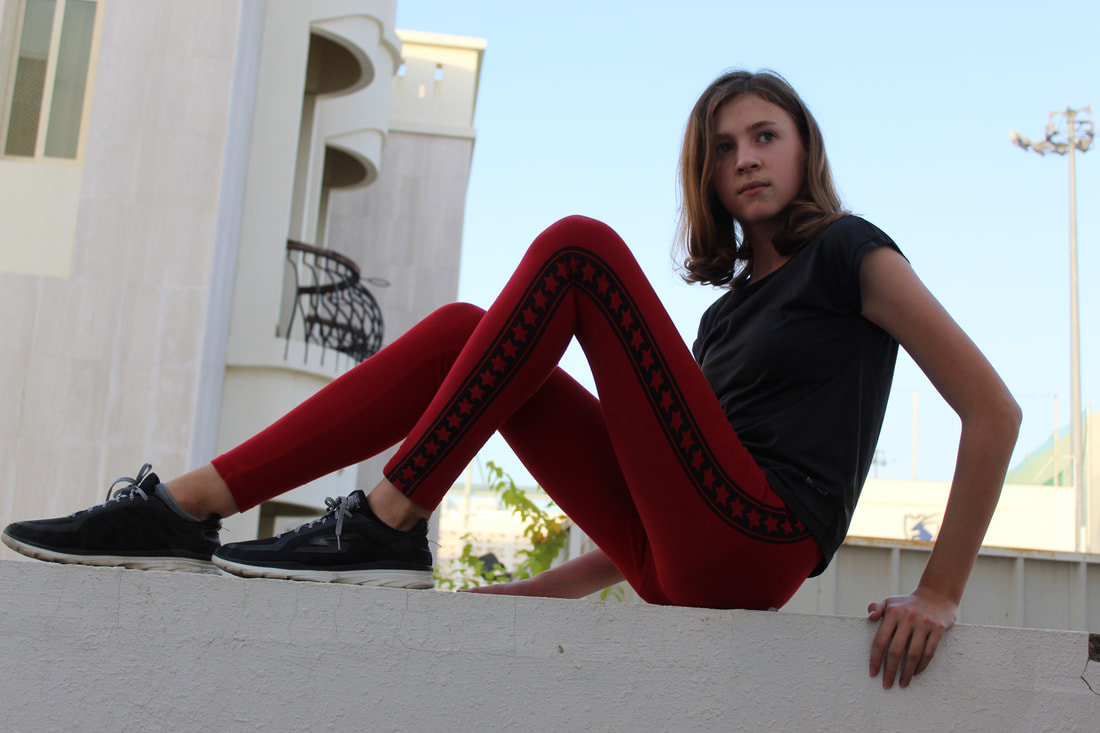
I chose a patterned sport leggings because I really thought I would be able to bring out the bright colors in them and make the advert brighter and grab more attention. I thought that the outfit complimented the model's body as the tight fit of the leggings brought out the length of legs which is a standard 'want' in the sports lifestyle.
|

With Katya I already knew she had long legs so I wanted to show that off with a cropped t-shirt making her legs really stand out and making her look more athletic in the images. With the colour choices I wanted something more simplistic than the first outfit so I chose the colour red as it is bold and could be easily changed and photo shopped to play around with the colour and temperature. Once again I chose a black t-shirt here to bring that element of boldness to the advert and also link it to the first advert and have something in common.
|
Equipment
|
|
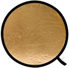
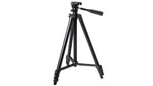
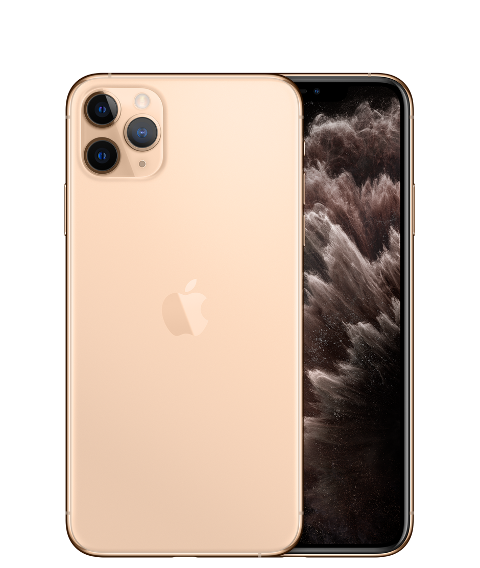
With equipment I was limited with what was available to me during the photo shoot since the school is closed due to the pandemic so I went ahead and borrowed a friend's Iphone 11 pro max alongside things I already owned and that I had and that included:
|
Gallery
|
When shooting for both my adverts I wanted to have 2 different races (initially I was aiming for a group of cultures and races but due to the global pandemic I was unable to meet other models and shoot with them) to broaden my market and ensure that the products I sell would be for all races and cultures and not just one particular culture. Also this may differentiate my product and brand from others as it is made for all backgrounds not just one.
|
One problem I faced during the photo shoot was that there were some pictures not properly or perfectly taken, in terms of the background and the wrong direction of the lighting (since I wanted to use natural sun lighting (golden hour). Also some of the poses were uncomfortable to the eye or seemed out of proportion so I decided to do another photo shoot to ensure that my advert was the best it could possibly be.
|
Brand Name:
With my brand name I wanted something to be related to having a healthy lifestyle and making 'staying fit' into something that is embedded into a routine and a daily life cycle. I also wanted something really simplistic and not too complicated so that my audience find the brand memorable and easy to remember, recognize and say. In the end I went with the brand name 'Fitahloic' because I found it really simple yet related to staying fit and almost being addicted to being fit and obtaining a healthy lifestyle at all times and making it part of the person's life and something they could not stop. I also found that almost all of my audience liked this brand name (primary research). I also came up with another name: 'Sportlada' which most of my friends liked as it stood out and was obvious that the brand was for women clothing. After asking all of my friends and family I came to the conclusion that 'Fitaholic' was the most suitable brand name.
Slogans:
When choosing my slogan I was mainly inspired by big brands such as Nike which had short simple and memorable slogans. Short and Sweet. After brainstorming many slogan ideas and asking my audience, they had all said that 'Fitaholic-Go for it' was the best one because it had the brand name within it, so it was easier and would be more memorable and easy for the audience to understand what it was about. Also they thought that it rhymed with the brand name and so was memorable and sounded 'Bouncy'.
Logo:
When designing my logo I wanted to experiment with lots of different shapes but found that none of the shapes really suited the brand name or font except the rectangle which was quite surprising as I had wanted something irregular, unique and out of the blues however, I came to the conclusion that using a basic shape such as a rectangle is more likely to bring more attention to the brand name and the whole advert as studies show that most humans like to look at regular and basic shapes.
|
|
|
My audience and target market seem to be liking the logo on the left compared to the logo on the right because they say that it looks more professional and stronger, whereas the one on the left seemed softer and classic to them and they were not a fan of the 'F' being in a different font as they thought it looked "clashing" with the sports theme and the font looked more classical than strong.
Final choice of advert photos:
After looking at both photo shoots I have decided to choose the following:

MagazineI specifically chose this picture for the magazine advert because from my primary research, my target audience thought it was 'Chilled and relaxed and suited the magazine vibe', they thought it was both elegant and chilled yet still sporty and was obvious that it was about sports clothing. When editing this advert I will try to blur out the background as much as I can where it is needed. However, I do not intend on blurring out the wood background as that is one of the main "Urban" elements in my advert. I will try to include some parts of the model's trainers and blur out the unwanted parts, making the whole advert more professional.
|

BillboardMy target audience really thought that that this picture suited being on a billboard. They found it 'Bold' and they also said 'It's impossible not to see it' which is exactly what I wanted as this will be in a place so big, and possibly next to many other billboards, it would need to stand out and look unique and different and bring attention. My audience thought that the colour blue of the leggings that the model is wearing is very noticeable and attracts the eye almost immediately, whilst the white trainers really gave the model a bold and ecstatic look making it obvious that it was a sports clothing advert. This made me sure that this picture was the most suitable for being on a billboard. When editing this photo I really liked the idea of having some sort of scribble or graffiti element as the background to make the model stand out and also give the whole advert a chilled and modern vibe to it.
|
Social Media BannerWith the social media banner advert I initially had thought that the Billboard photo would have suited it better, however after some thought and discussions I have decided that this photo suits best as the social media banner advert seen as the model here could easily be cropped to the correct ratio or I could cut the model from the background completely and making her smaller and adding a more professional and blank colored background. This is because most social media banners seem to have relatively narrow areas across the top of the screen. One main thing I intend to do when editing this picture is that if I am keeping the wall (meaning I am not completely cropping the model) then I would need to turn my advert so that the wall is in the correct ratio. Initially this was meant to be a moving advert instead of being a social media advert however we had to change the moving advert seen as we are passing by a global pandemic and therefore won't have access to high quality equipment inside school and so the product would not have been to the highest standard and so therefore we have chosen to instead create a social media advert.
|
Primary Research:
Coming to conclusions about major decisions like the brand name and pictures and so on I asked multiple of my friends and sent out a survey to my target audience, this is shown below:
Results and evaluation:

This really helped show me that 'Fitaholic' was the most suitable brand name seen as basically all of my target audience preferred this brand name.
|

This again helped indicate that 'Fitaholic was the correct choice as it was obvious to my target audience what this brand name was about.
|

I agree with this as all sports brands need something bold to resemble power and strength in their products which is what me and my target audience are looking for.
|
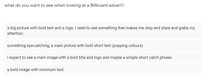
This helped me understand what my audience were looking for in a Billboard advert, something bold and eye catching to separate the advert from the rest. I think the whole concept of the Billboard advert is the easiest to understand seen as there will be the minimum text needed however it will be a challenge in editing the image as it will have to be as professional as possible seen as any small mistakes would be noticed and so this would require a lot of time on Photoshop experimenting with different tools.
|

This helps me get an idea of what my target audience expects to see in a magazine advert, I still think I need to do some research in terms of what text I will be adding and whether it will be science text or quotes and I will also need to experiment with the layout of the text and the order of information and how I am going to balance it all together.
|
Once again, I find myself having a good understanding of what exactly my audiences are looking for. One thing I really like is the whole concept of having limited colours within the image yet bringing attention to the model and have the main colours on the text making the colours pop and having a balanced colour scheme.
|
Evaluation:
Overall, I have really found this survey and the results very useful in giving me a picture of what my target audience are expecting to see and what appeals to them. Surprisingly, I have also already had many ideas and inspirations from the feedback I received which also consolidated that I was on the right track.
Overall, I have really found this survey and the results very useful in giving me a picture of what my target audience are expecting to see and what appeals to them. Surprisingly, I have also already had many ideas and inspirations from the feedback I received which also consolidated that I was on the right track.
Final adverts
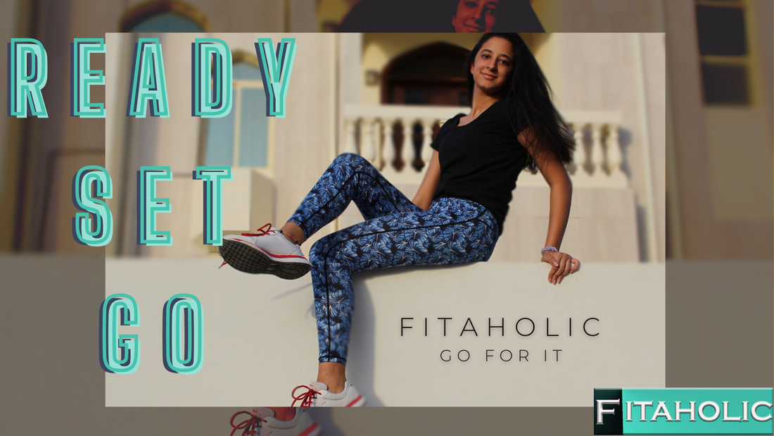
Social Media Banner: Instagram

During the editing process I came across many challenges, however was able to pass them. A great example would have been removing the original background and replacing it with the simple background as shown here, when trying to cut out the background I had some trouble with some parts of the model being removed and so I did some research on Photoshop and found some options which allowed me to manually remove and clean any errors. At first I had decided not to remove the colours however after showing my target audience, I got very useful feedback suggesting that I could try to make the main image black and white to avoid any clashing of colours with the different shades of blue and green. After taking their advice I had found that the whole image was much better in black and white as the model was standing out yet not taking away attention from the rest of the advert and the logo. After finishing off the final touches I moved the advert on Instagram and made sure that the whole picture fit the post grids and that nothing was altered or cropped from the advert. Overall, my target audience loved the advert: "If I saw that advert on Instagram I would definitely stop and click on it and try to find out what it's all about and what the brand is and maybe even be interested in buying their products, I also like the limited colours as the whole green and white colours and text pop now yet still giving the model the main attention, I love the balance and how symmetrical and relaxing it is to the eye!"
All in all, I am very happy and satisfied with how the advert had turned out. After many experiments, I think this is the best way the image could have been used where the attention is evenly spread and balanced yet there is still an order as to what the viewer sees first. I think this advert would appeal to my target audience as it checks all their boxes in terms of colours and text and how limited somethings are making the whole advert look professional.
All in all, I am very happy and satisfied with how the advert had turned out. After many experiments, I think this is the best way the image could have been used where the attention is evenly spread and balanced yet there is still an order as to what the viewer sees first. I think this advert would appeal to my target audience as it checks all their boxes in terms of colours and text and how limited somethings are making the whole advert look professional.
Billboard advert
With my Billboard advert I wanted to play around with the background and try to bring most of the attention to the model. At the start I wanted to use the same idea as my social media advert however, after going through the whole editing process and coloring process I found that the backgrounds seemed to be clashing with the main colors of the model and what she is wearing. After editing the background out and showing some of my target audience, they had suggested to keep the background or try to make it darker/less visible or transparent. I understood the image that they had in their minds but when it came to the editing, I got the idea of trying to blur out the background. So, I had a play around with the options and tools available on Photoshop and watched multiple videos to understand the whole concept and did some trials to get comfortable with the tool before going and editing the final image. Overall, I am impressed with how well it worked out without making the whole advert seem to blurry or look unprofessional. I also wanted to meet the standards and demands of my audience so I went ahead and added the image again in the background and zoomed in with a dark filter to add the effect of repetition and making my advert fuller. When it came to the writing, I had some trouble finding the right and appropriate fonts as I wanted the writing to stand out and get as much attention as possible. I mainly had the problem of the font looking too thin to be seen from a further distance so I ended up layering the writings over each other making the shadow effect which matched the whole repetition idea of the pictures. When adding my logo onto the advert, one thing that became really obvious was that the colors of the background and clothing did not match and caused a clash of colors, so I decided to try and add a filter to the logo to try and alter or play around with the color and ended up choosing the normal original logo with it's proper colors as I had chosen the palette of the turquoise blue and so it matched the whole advert theme and writing yet still keeping the whole concept of the logo alive. After showing some of my target audience the final advert (shown above) I got lots of positive feedback. Some examples were: "It looked really professional" and "caught my eye instantly". In conclusion, I really enjoyed playing around with this image and finding the most suitable options and palettes, I also think I succeeded in achieving the main goal which was to make the advert as eye-catching as possible and to be recognized from a distance.
Magazine advert
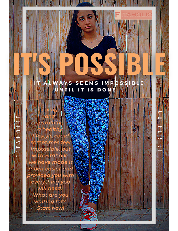
When editing my Magazine advert, I wanted to make the colours of the original image to stand out more so I had a play around with a few apps before moving the advert onto Photoshop and properly editing the advert. With this advert I wanted to keep the background as it added an urban and natural feel to the advert which represents what the whole brand is all about. Something that I was not expecting was the patterns of the wood to match with the floor as I expected them to clash or look unprofessional however, after some editing and filters they seemed to add onto that natural feel that the wood was already having on the image. One of my audiences feedback was: "I really love how the floor seems to compliment the main background and making the whole advert have this urban and natural feel which is really hard to find nowadays in magazine adverts! It also adds this bold and strong look to the whole advert". When looking at other adverts from other brands and big companies, I noticed that they almost always have this ongoing theme or palette throughout each specific advert. So, I decided that with this advert I was going to have the theme of pastel light colours like the pale orange used and mix it with the use of the basic white which makes the advert seem more professional. I really liked the whole idea of having a catchphrase so big and bold and going out of the box which has this hidden meaning or being unique and achieving more than needed or exceeding expectations, which compliments the whole idea of thinking that something is so impossible (the box/outline) but being able to make it possible (going out of the normal/box). With my logo I wanted to create something unique that is not often seen in brands which made my bran unique. I made the logo palette and colours change in every advert to match the theme and palette of the advert. This is not really seen in many adverts or brands as they all want their logo to be recognized for one colour or style however, I wanted to have my logo to change in the adverts to represent how not every advert is like the other representing how people are also different and unique. Overall, I am really happy with the final result and how the advert has turned out.
