Social media advert
|
Magazine advert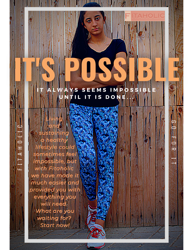
|
Billboard advert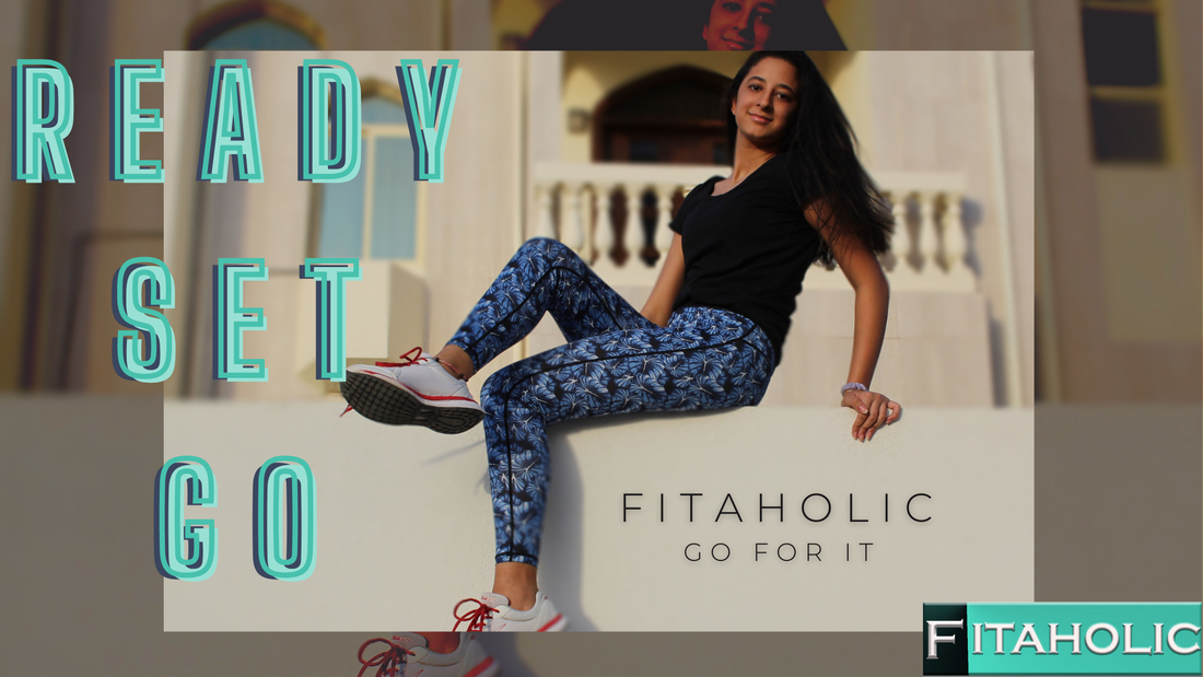
|
Focus group questionnaire
To come to a conclusion and construct an evaluation I had to understand and hear what my target audience thought of the final adverts and if they liked it or not and why and so I went ahead and made a survey using Google forms and asked all the necessary questions to my target audience, below is the survey:
Feedback
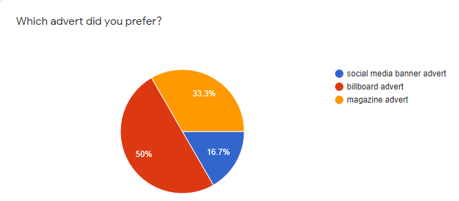
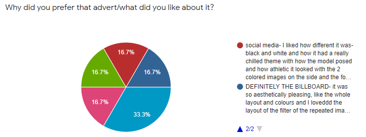
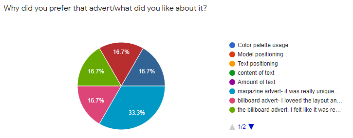
It was clear from the results that the billboard advert was my focus group's favorite advert!
|
With this feedback what I noticed was that most of them had been speaking about the billboard advert and how catchy the colours used were and how they liked the background so I am pleased with the outcome.
|
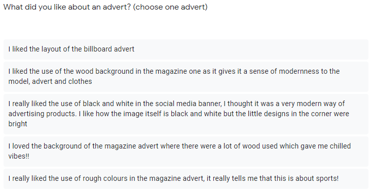
In this question I noticed that most of my focus group chose to speak about a different advert from the one that they preferred and this tells me that most if not all the advert had some elements making them successful and noticeable to my target market.
|
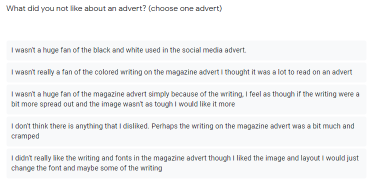
Something that was quite common where my target audience were not so fond of was the writing on the magazine advert, most of my target audience had said things along the lines of "there was too much" or "It was not clear" and this goes back to the colour choices and options and so I think if I had added a darker background writing that may have helped keep my palette but make the writing appear less and more noticeable.
|
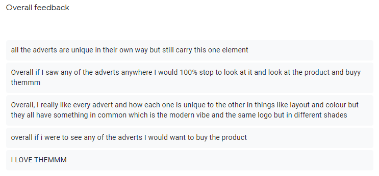
I was pleased with the answers I got from the overall feedback. Most of my focus group had said that they would look at the advert and would want to find out more about the brand and buy what the brand sells and so this lets me know that the adverts had been successful in serving their purpose!
|
Evaluation
In this evaluation, I will be talking about my finished product and comparing them to each other and judging the qualities of things like the aesthetics and persuasion and other things such as their strengths and weaknesses and intentions in further detail.
To start off, I chose to advertise sports clothing for women. I chose this product in particular because I know it is a big market with huge competitors and has the most potential success as there are more customers in this market than in any other and so this means that I have more potential audience as this is one of the biggest fashion/sports markets. I made it clear with my USP that I sold sports clothes purely for women and so this is what made my brand unique. My main aim was to make my adverts attract and appeal to my target audience, who were women from the ages 16 and over, and persuade them to buy my product. When conducting both primary and secondary research I was heavily inspired by many existing products made by other brands where it was evident that their advertisements were successful. I was also inspired by the feedback I received when conducting some primary research and asking my focus group and target audience where they had given me an idea of what they imagined the adverts to look like and what caught their attention, for example a response when conducting one of my questionnaires was “Blue really stands out when I think of sports and sportswear because it reminds me of nature and I associate it with health” and so this inspired me to create a shade of blue for my logo and incorporate blue within my model’s clothing and some of the backgrounds. In the end I think I was successful in fulfilling my intentions to start with.
Moving onto the finished product and the end results I will be looking at each advert and looking at what was successful against what was not and comparing them. To start off, with the social media banner one factor that became obvious when reviewing the feedback from my final survey was that most if not all my focus group thought that the use of the black and white image was very effective with the logo and the colors of the text and the positioning and the overall aesthetic was very sporty and vibrant and it fulfilled its main use which was to persuade my target audience to look at the advert and potentially buy the products, this was evident with the reply from one of my focus group members ‘I liked the contrast between the black and white background and the teal text and how the model fits the whole frame. The added design is subtle but still draws attention, the logo doesn't seem to clash with the ad itself and the paint effect on the picture is appealing’. Contrastingly, I received some feedback about my text positioning: ‘In general the advert is appealing to me but I am not on board with where you chose to put your text, I think it would look better if it was at the bottom’. Usually, I would agree with my audience about any negative feedback but seen as this was the only feedback I received I went ahead and asked my peers who also happen to be working on the same assignment and all of my peers had said that the text was perfectly positioned and that if it were near the bottom part of the advert it would look too basic and dull and so I will have to disagree on this feedback. Moving onto my Billboard advert, the main strength in this advert was how the background was blurred then repeated which added this extra element of urban feels to it. The main strength in this advert was the use of the rule of thirds and how it was relaxing yet catchy to the eye, this can be seen here ‘I like how large the text is and you've followed the rule of thirds in its placement’. A weakness in this advert however, was how many things were going on at the same time and so was a bit too much for the eye and it may be distracting to any drivers, If I were to go back and make improvements I may remove the double background and make the writing doubled so there is a shadow and it is visible yet not too much for the audience. Finally, I will be speaking about my magazine advert. I think with my magazine advert a huge strength I had was the positioning of the model and where she was positioned and the wooden background. From conducting my form I received lots of positive feedback, examples of this were ‘I love how the model is posing, it makes her seem so strong and bold and generally works with the advert’s point and product’ and ‘ I really think that how you chose the wooden background really works with the urban feel I get from the whole advert and I feel like it is really well framed and put together’ I agree with the feedback that I have received and I think it is fairly accurate and detailed. With the improvements, one thing that became clear was the saturation of the picture and how the text was positioned, this can be shown in this feedback ‘I think that the photo could have been softer in general, I think also if the text was moved up and positioned around the model herself it would perhaps look a bit more appealing to the eye and comfortable and not too rough’ In all honesty, I think this is the most accurate improvement feedback where this person has not only told me what doesn’t work but how it could be improved and other ideas, I agree with everything said and if I were to go back and make improvements on my magazine advert I would definitely use this feedback and take what was said into account.
Going back to my pre-production and production processes, I initially was inspired by ideas that I already had from my target audience when I conducted my survey. Obviously I didn’t have a clear idea of what the adverts would look like at the end but I knew that I was aiming for persuasive, technical and professional adverts and one major source of inspiration was looking at other sports brands and how they advertised and made their products look expensive and appealing. Overall I was going for urban and futuristic aesthetics and looking back at my adverts I am proud to say that I have achieved that, through things like the choice of color and the fonts and positioning of my text and my model’s overall look. Furthermore, I think that I was successful in convincing my target audience to buy the product shown and this was clearly shown within the feedback I received ‘I really loved all the adverts and overall they work really well together and I would certainly buy the clothes shown!’. I think the hardest part when creating my adverts were editing everything and making sure there were nothing unneeded ruining the background, an example of this would have been editing the background of the social media banner since there were a lot of things going on as shown in the original picture there was a lights stand and buildings and so it took time and patience to edit everything out and add the other black and white background in. However, after finishing my advert I think it was worth the work. Another problem I faced in the pre-production stage was choosing the right images that were comfortable on the eye and so in the end I chose to do a second shoot and once again, after finished products, it was worth the work put in.
All in all, I think when evaluating my products I definitely had some areas where I could have improved or changed if I were to go back however, I also think I did the best that I could and I am proud of the amount of effort, time and work I put in when creating these adverts and I am more than satisfied with the outcome and feedback I received!
